Levelling up the Procurement Process for Both Buyers and Suppliers Alike
Role
Product Design Lead
Summary
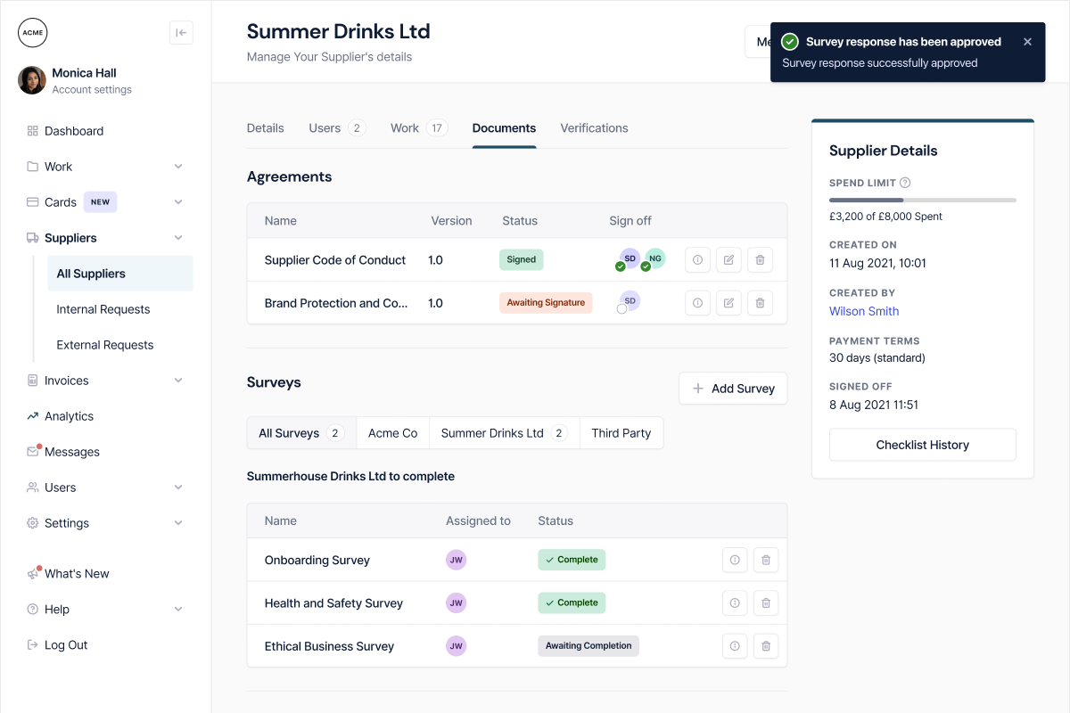
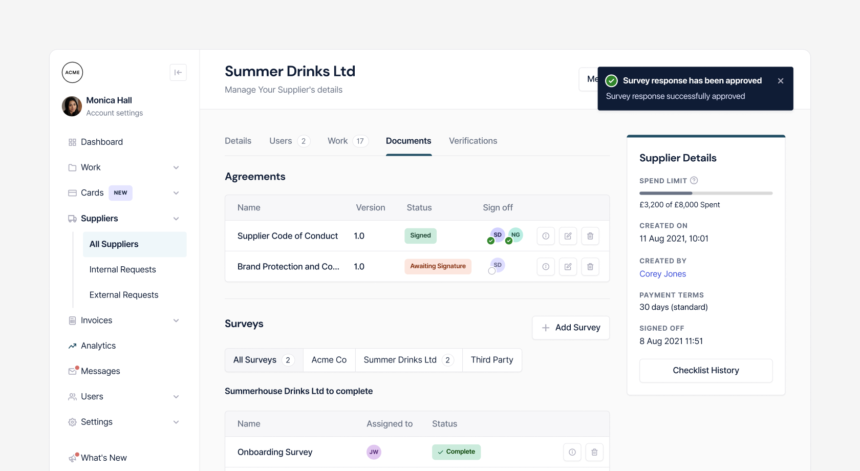
Paid is a procurement challenger platform that makes it simple for buyers to onboard their suppliers, automate contracts and streamline the payment process for all involved.
Goal
Improve the working relationship between buyers and suppliers. Making the procurement process an equal opportunity for all involved, regardless of size.
Discovery
Market Analysis
We could segment our competitors based on the depth of service they offered and how closely related they were to the problem space we were operating within.

User Research
User interviews
We took the 20 most active suppliers on the platform and reached out to them with the offer of participating in our research study. We were able to speak with the majority of the suppliers to understand their perspective on the things that were getting in the way of working efficiently with their clients.
To ensure we were supporting the needs of our customers on the buyer side as well as the suppliers, I gathered insights from our internal customer success team to identify the key themes that were preventing them from getting the most out of the platform.
Research insights
- Suppliers found the onboarding process to be too long and didn’t know why they were being asked certain questions about their business.
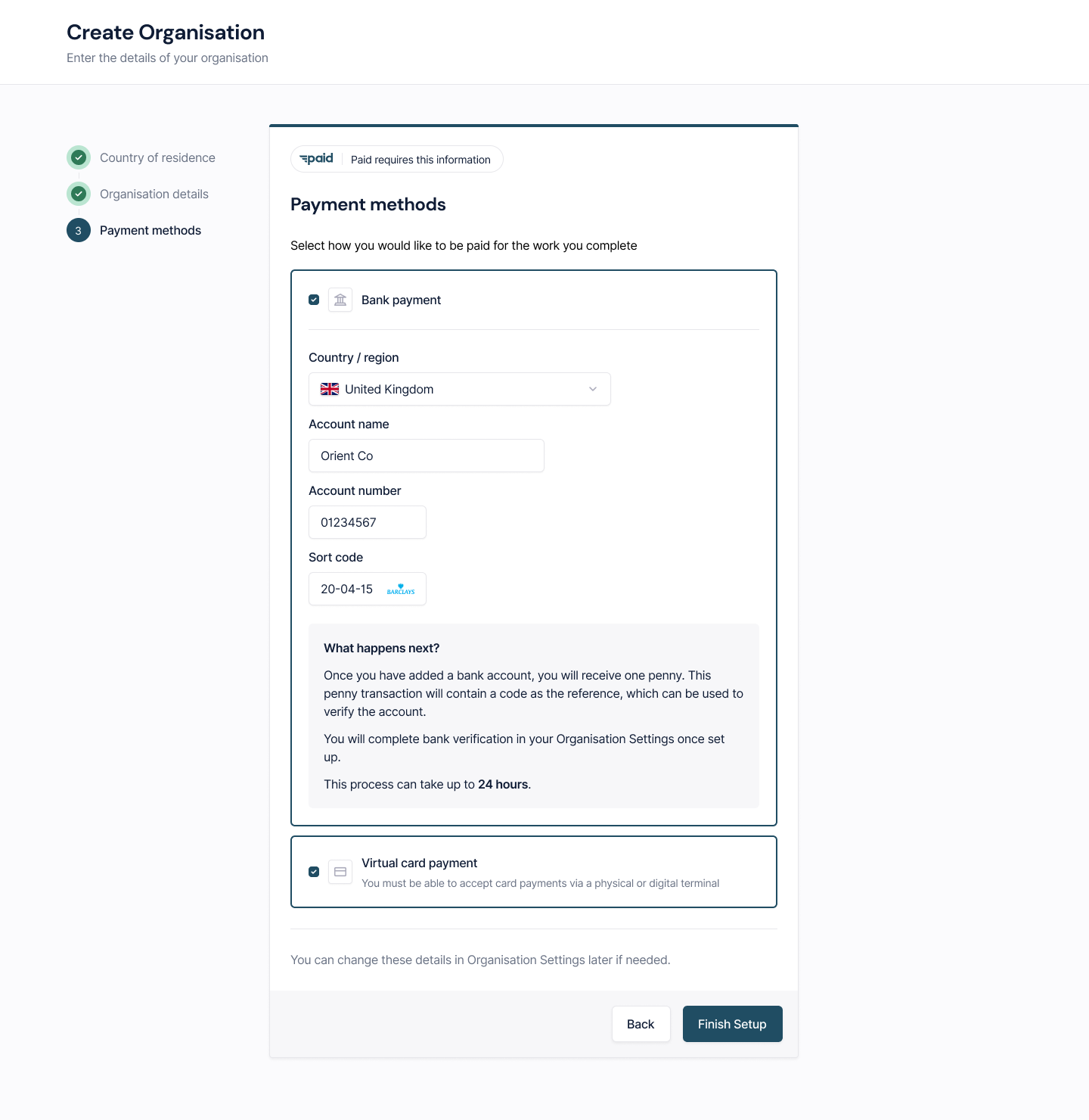
- Suppliers who had a brick and mortar premises would often prefer to have the option to take payments via card online.
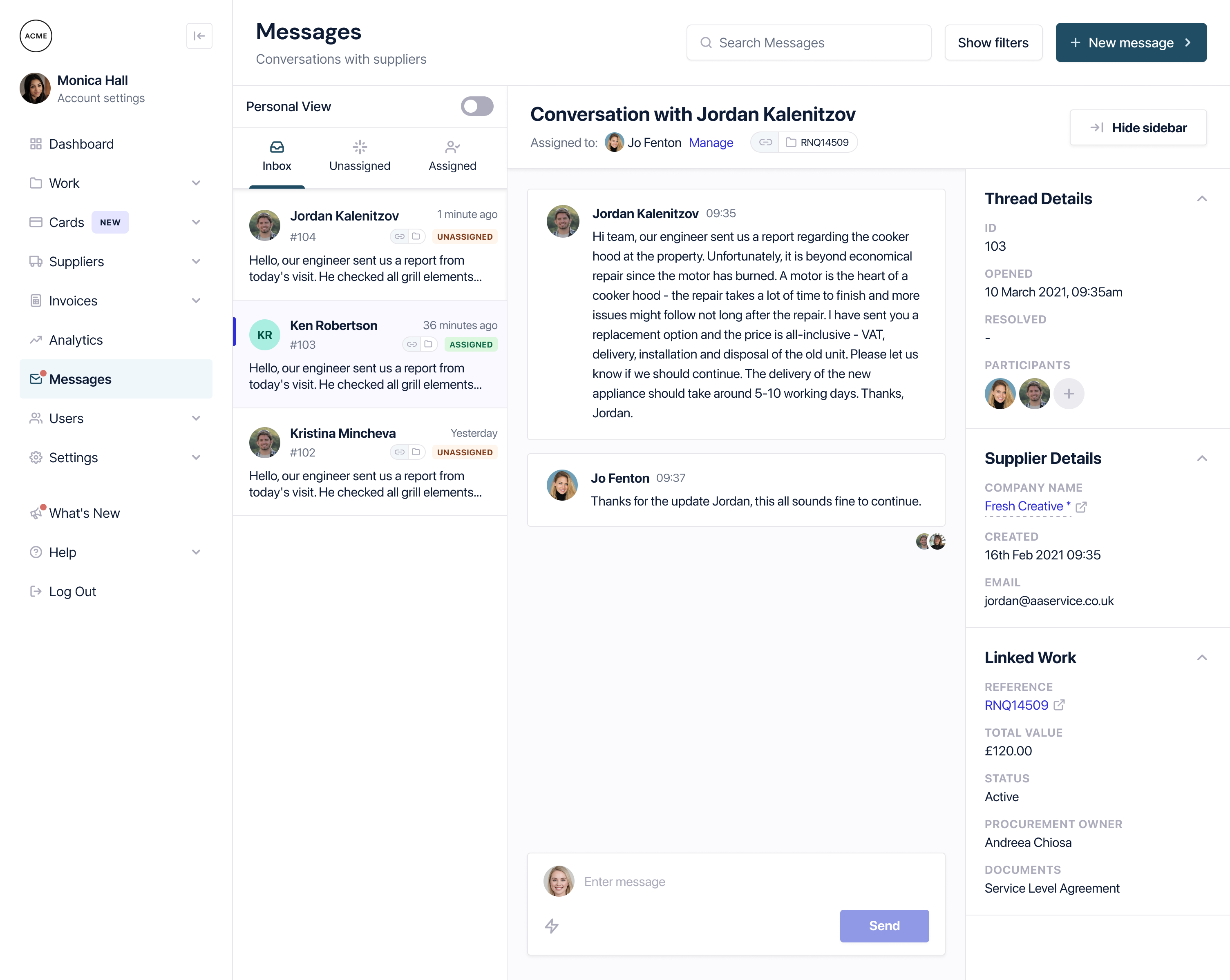
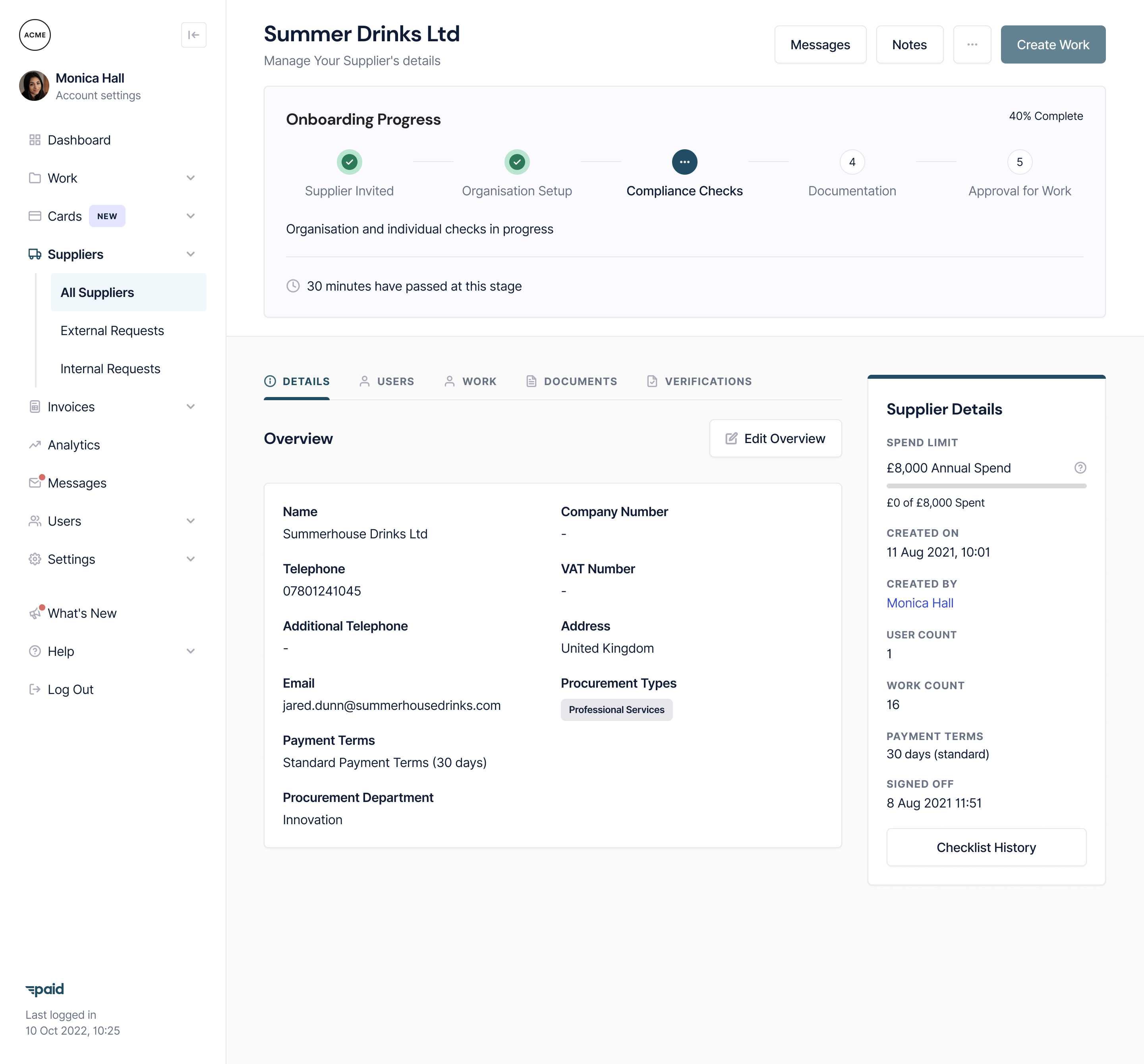
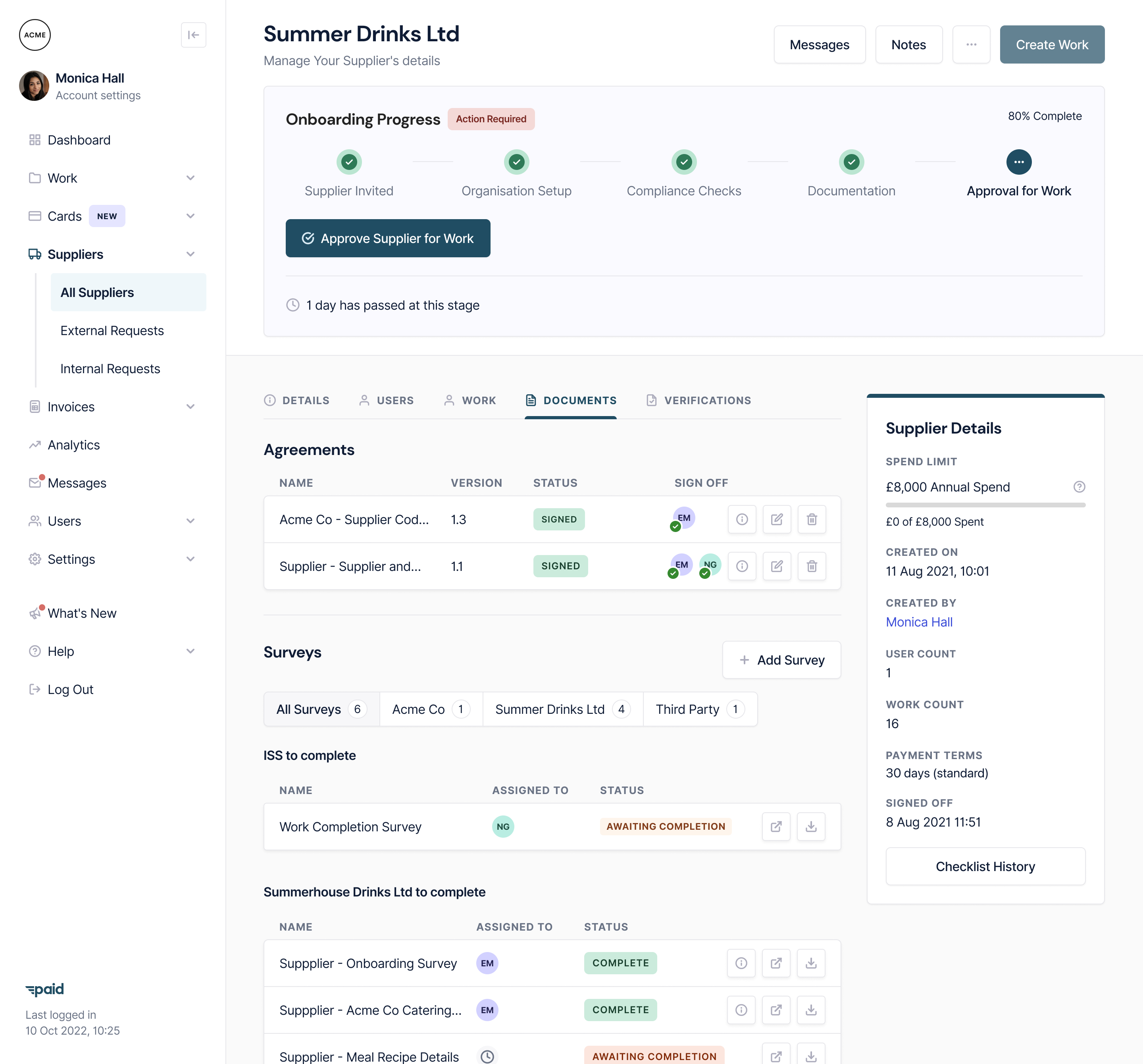
- The most common issue buyers faced in the process of working with suppliers was not having visibility of where they were in the process of onboarding and completing the work.
I lead the supplier research, arranged the monetary incentives ahead of time, and spoke with the business owners directly via phone and video calls.
Following the study we were able to build up a pool of reference clients on the supplier side that made further rounds of research much smoother, getting the insights into the team and iterating much faster than before.
Synthesising the insights
Taking the key themes forward, I ran workshops with internal stakeholders to share the details to ensure alignment between user needs and business goals.
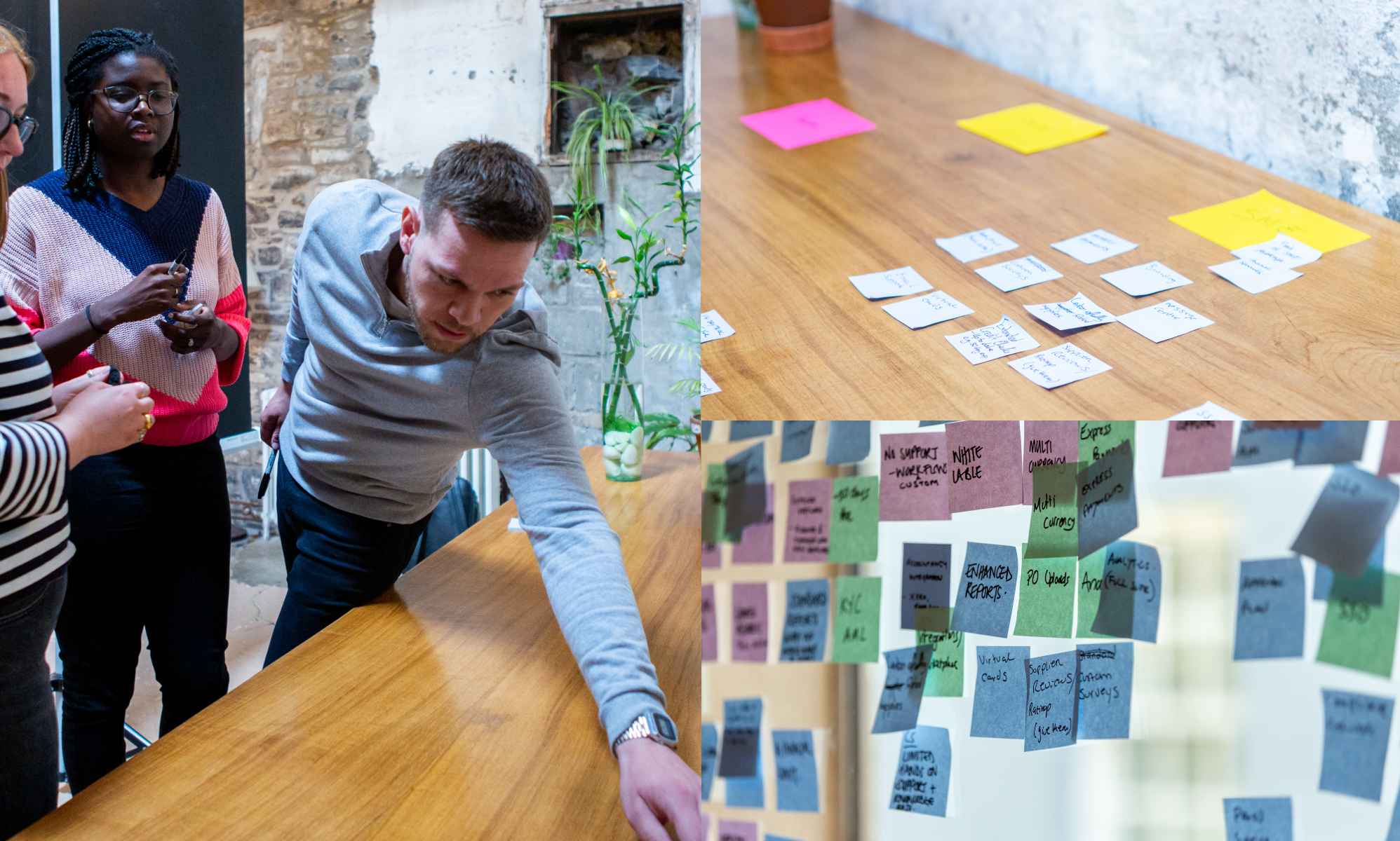
The output of these workshops included
- A decision to move forward with additional payment options based on user preference.
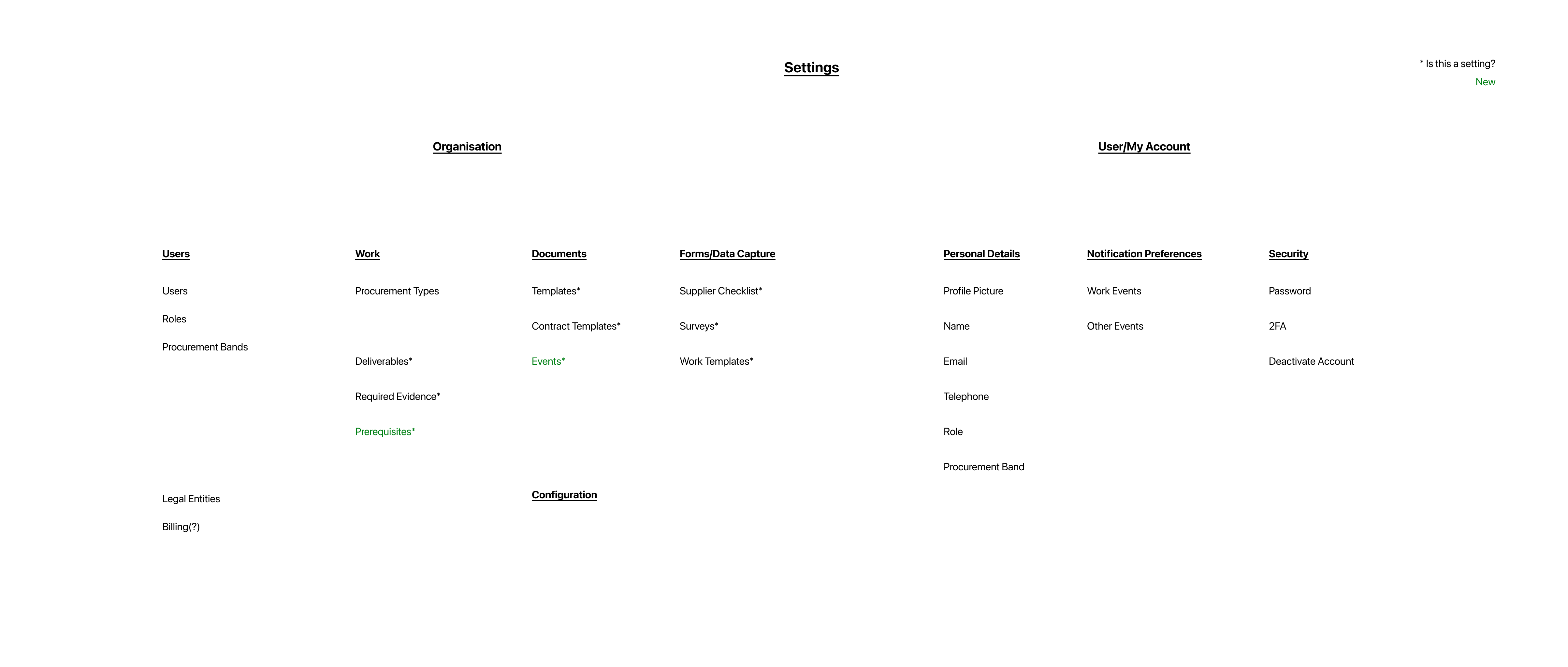
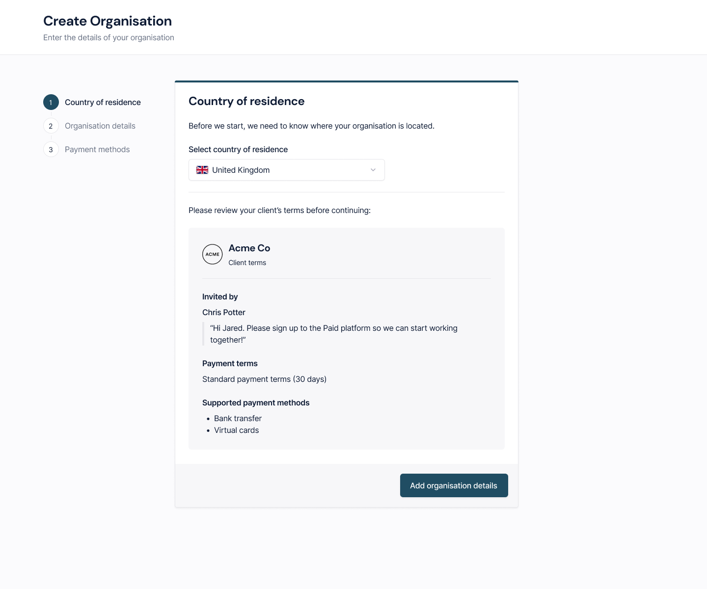
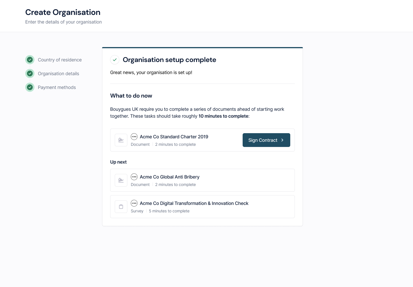
- Revisit the supplier onboarding flow from the ground up to see where we could remove unnecessary steps and make it clear why we needed to capture the information we were asking for.
User personas were enhanced to act as reference points for the team to ensure a shared understanding when building out our solutions.


Overcoming issues
Some suppliers had large, long term projects, so they only needed to access the platform once every few months.
To address this use case, we wanted to ensure that people could easily pick up where they left off when returning to the platform.
Working with engineering to ensure suppliers could get a high level of security without needing to log in in order to confirm a project or transaction.
We tested unique links based on the ID of the person receiving the email notifications, that granted access to a limited area of the product that would allow them to complete their tasks with as little friction as possible.
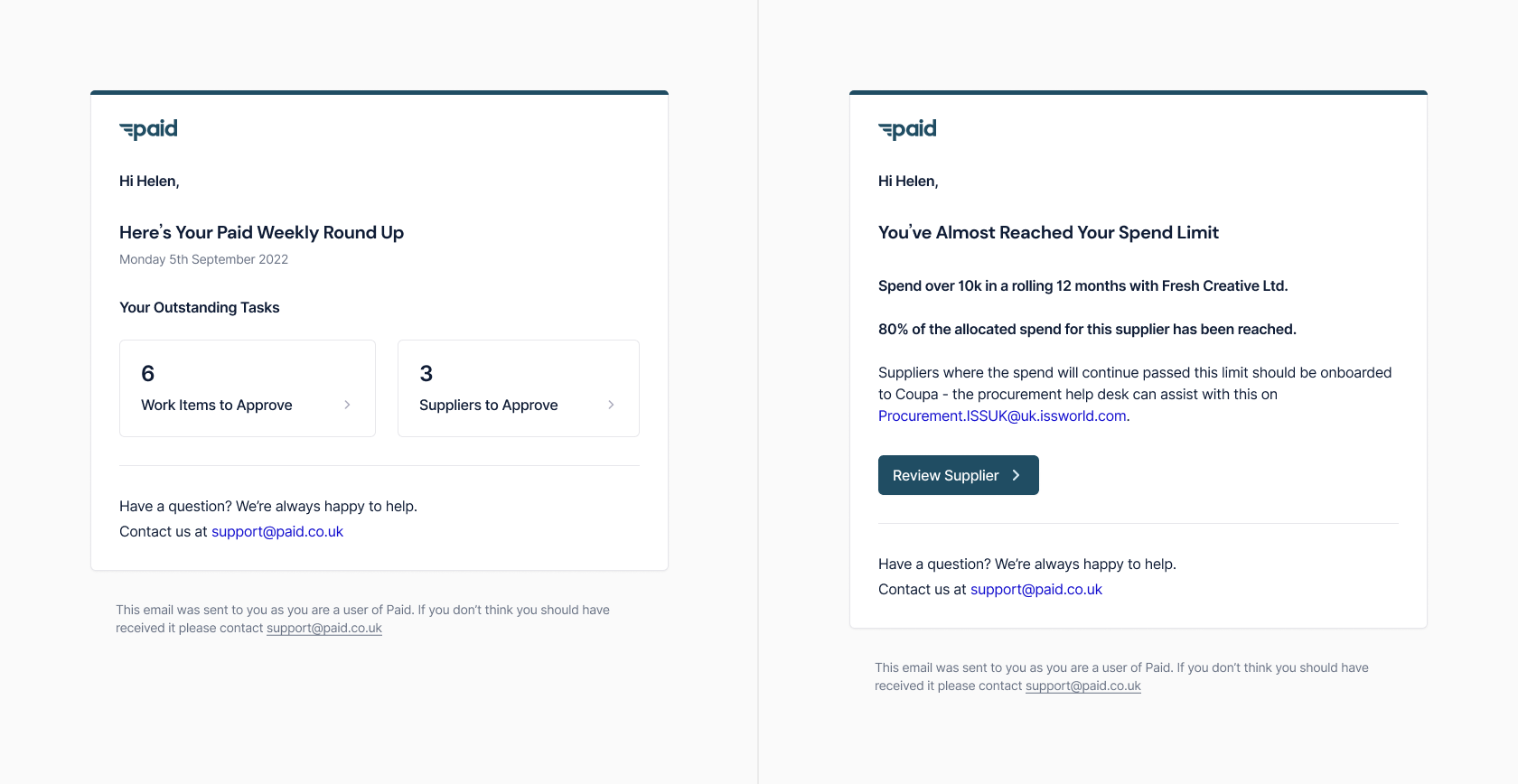
It was crucial to get the experience right here, since we still wanted to give a feeling of trust when signing documents and confirming payment details.
Outcome
We delivered the solutions and tested with our reference customers defined during our initial research.
Improved supplier satisfaction, improved buyer process and carbon footprint awareness.
We saw that the improvements we made to the onboarding flows brought more clarity and reduced the time taken to get setup. We also noticed a reduction in support queries around this process.
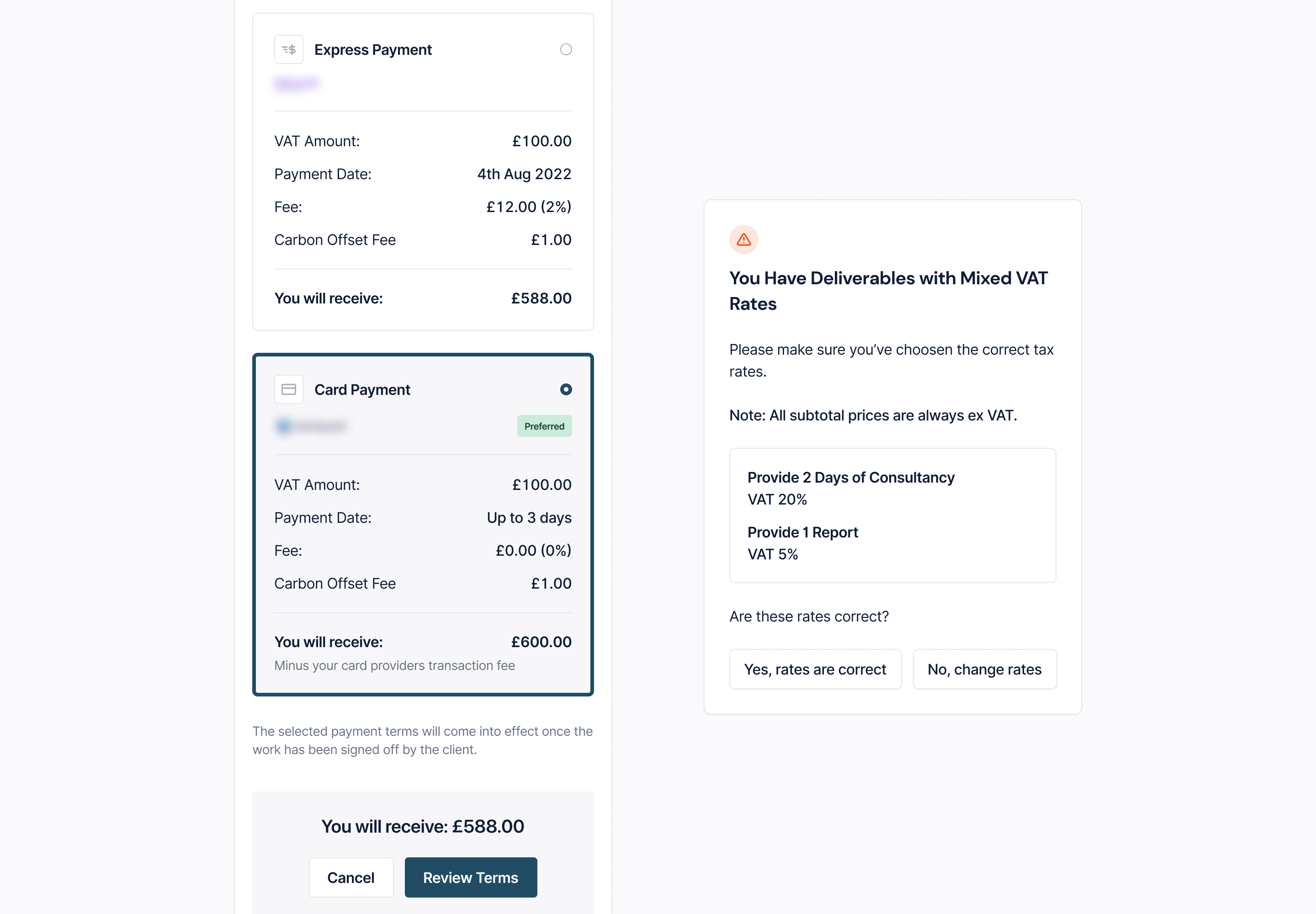
By allowing people to chose their preferred payment method during setup, we found a significant reduction in the average time taken to complete the once a job had been finished, meaning the supplier could be paid sooner than they previously had been.
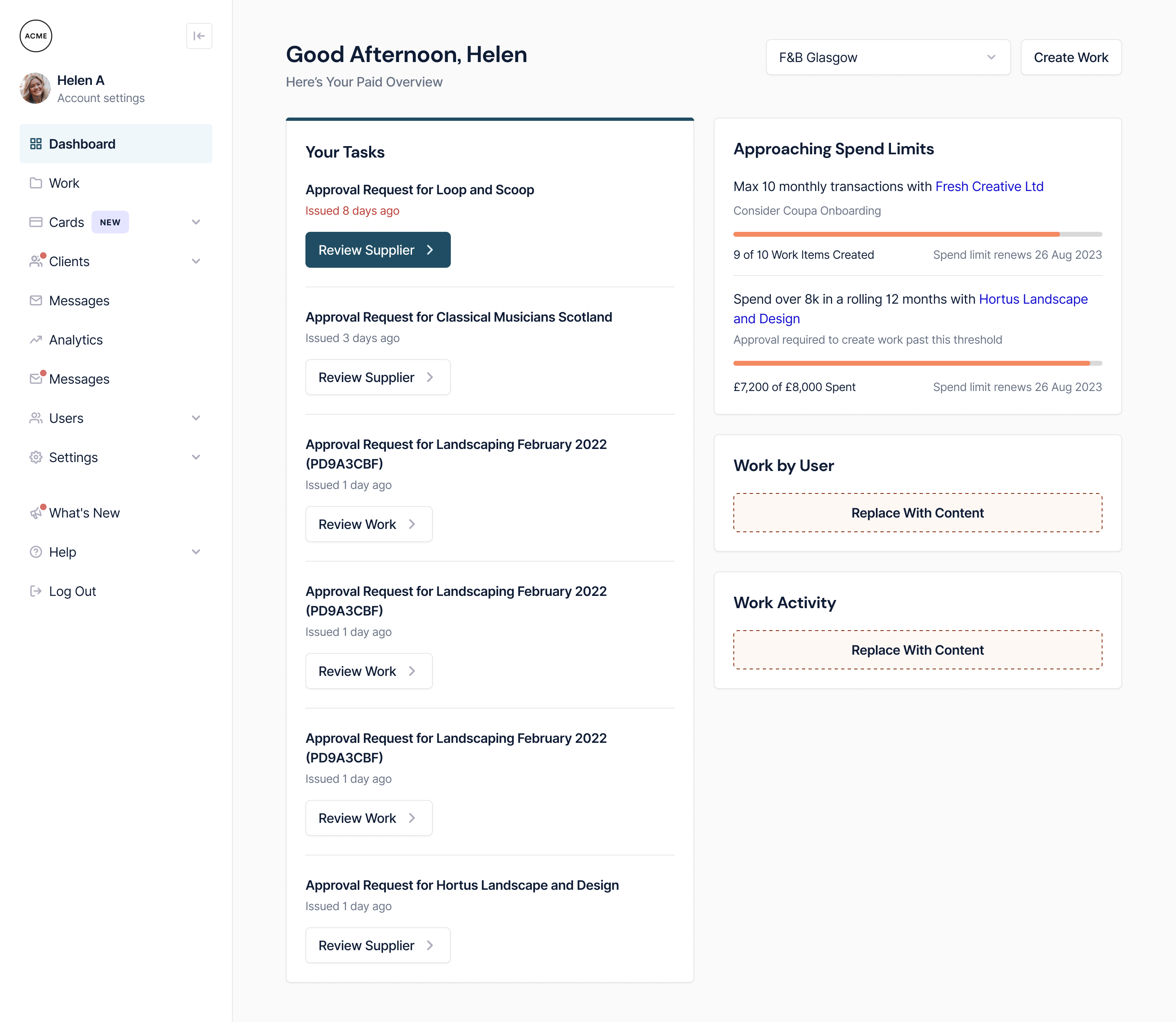
We kept in close contact with our biggest clients on the buyer side while rolling out more visibility on supplier activity. We saw a noticeable increase in user satisfaction with a reduction in time spent chasing suppliers over email, alongside a drastic reduction in supplier onboarding times due to the lightweight version we had shipped in the weeks following.
Design Operations
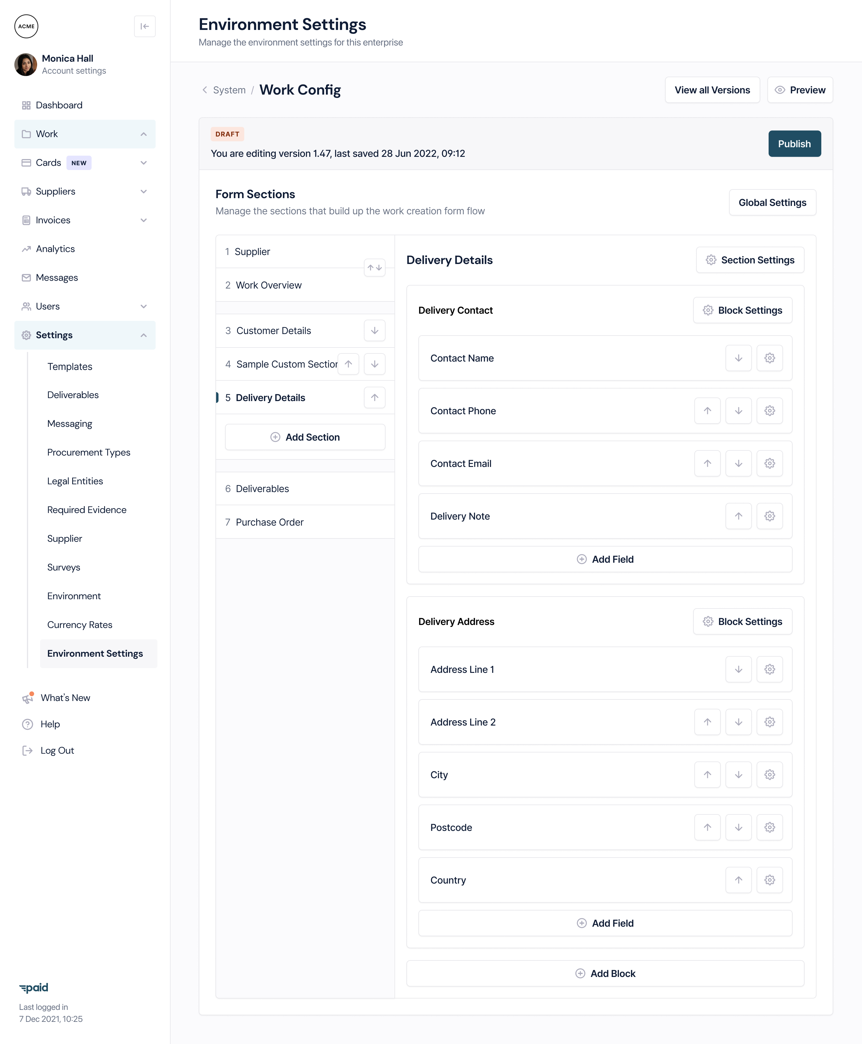
As the product grew and matured, it was clear that we needed to invest the time into creating and maintaining a scalable design system.
I took the lead on putting the foundations in place, porting over existing, validated designs to the system to start with a solid base, while working closely with our engineering team to put in place a naming system we could implement across the full stack.
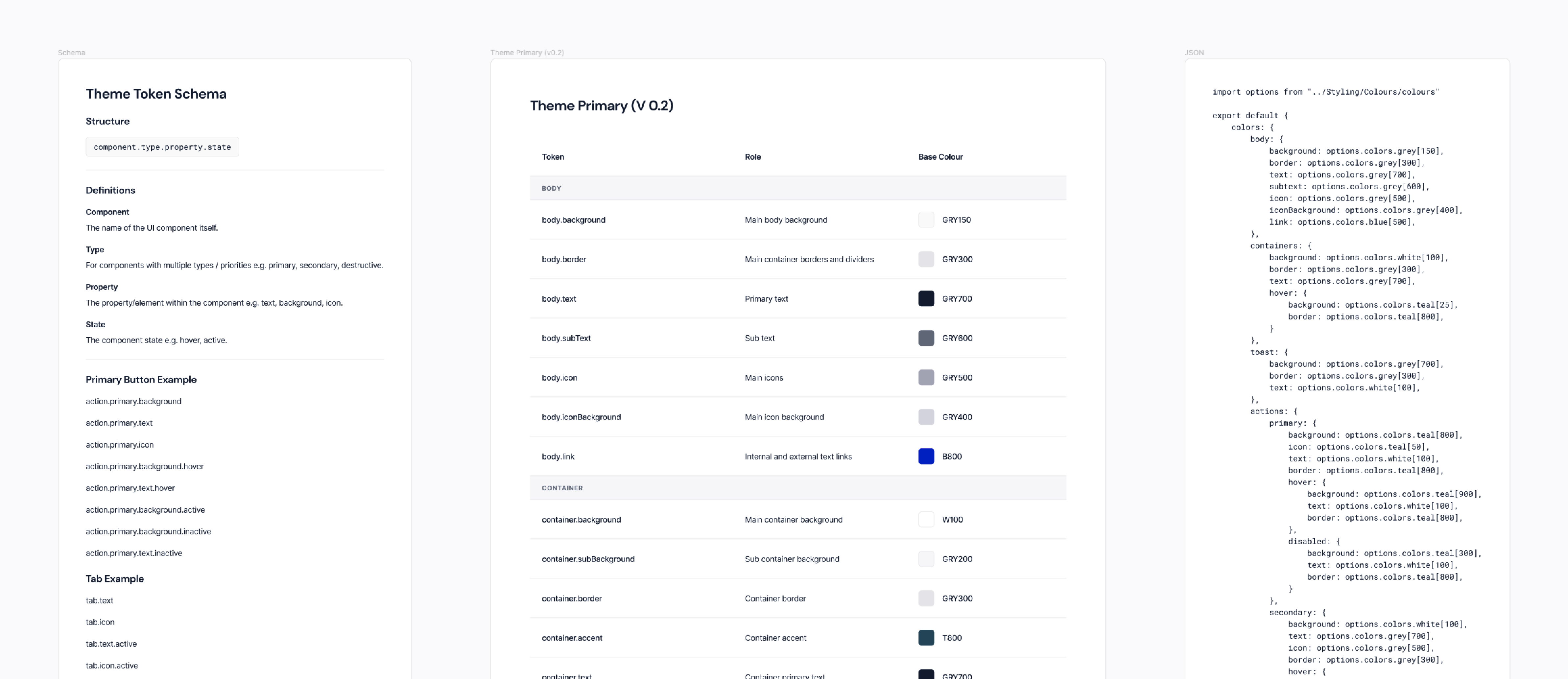
The investments we made into the internal designer and developer experience gave our workflow a boost. With Figma and Storybook always in sync, we could test out new features knowing the components and patterns used were established, consistent and most importantly, fit for purpose.
Reflection
Always keeping in mind the needs and wants of two separate sets of users was a huge challenge. Bringing with it a great opportunity to step back and see things holistically, helping me to arrive at solutions that would benefit both parties, while playing into the strengths and mental models of each.
Working with the team at Paid gave me a fresh perspective on how we the expectations in B2B and B2B2C software are now very much aligned with the consumer space when it comes to the user experience.
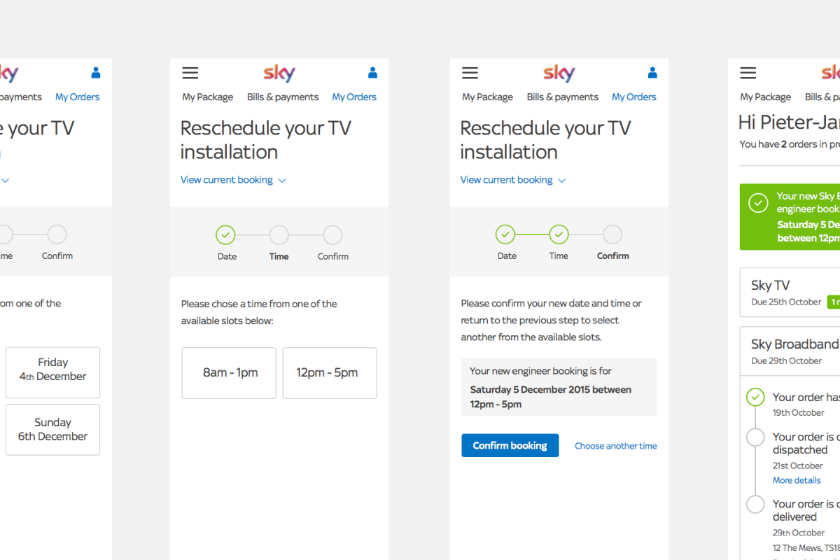
As we tested familiar language, and interaction patterns that would traditionally only be found in the B2C space, we found that many of the suppliers we served would prefer this approach to be carried over to their business tools.
Fundamentally, we validated that concepts such as gamification and delightful interactions can feel at home in B2B software, provided the feeling of security and reassurance remains when dealing with finances.
Additional Project Work
